


Table of contents

No headings in the article.
Welcome back to another epic devlog!
We don’t quite do the impossible work this time - instead, we do the necessary work. It’s the kind of work that isn’t as flashy or exciting, but for the sake of design transparency it’s worth showing. We need a way to launch this game, which means adding in a main menu!
Main Menu
When it comes to the main menu, one important item to include is the game’s title. Just in case the player forgets what game they have just launched or something…Truthfully though, making a logo for the game is an amazing milestone as a developer. If a game is considered a gift, then the logo is simply the bow on top - it represents all of the energy and passion that has gone into development!
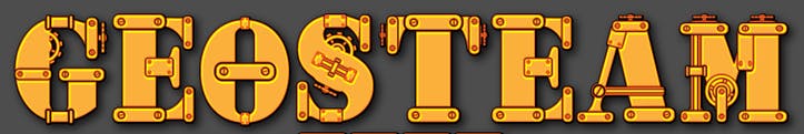
So, how did I come up with an amazing logo? By working smarter, not harder! Given the player is a robot and machinery has a central focus, fitting in an industrial/steampunk look made the most sense. I took the time to search through dozens of fonts until I narrowed it down to one. Here is a link for those curious:
https://www.fontspace.com/geosteam-font-f24054
This is how the font appears initially as an example (default text, not the game's title):
I downloaded this font, scaled it up massively in a text editor and then typed out “Echolite.” From there, an image was exported and uploaded into my favorite pixel editor - Aseprite! Next was scaling down the image and reformatting lines to make the lettering more consistent. Then, basic coloring (using the GUI palette for additional consistency) was used to fill in each letter. Finally, some extra shading and detailing (such as pipes, screws, etc…) were layered on top to give it additional depth. Here is the final result!
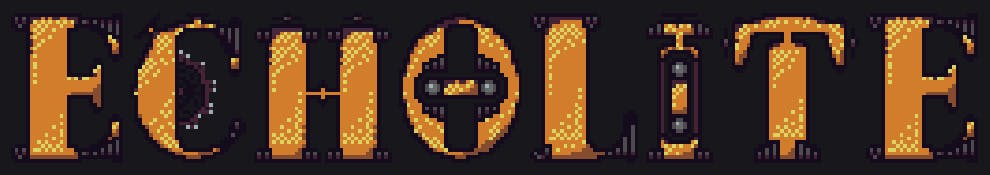
Those small differences really transformed this logo into something special that matches the overall aesthetic of the game. In the future, I would love to animate some of the gears, screws, wheels, etc... to give it even more character.
Moving to the editor, we are focusing on basic functionality. I opted for a “warm black” styled canvas as the background for all of the GUI elements. The logo is placed along the top (centered) and given a very straightforward animation. The AnimationPlayer node was used to move the logo up and down (very slow so that it's still readable).
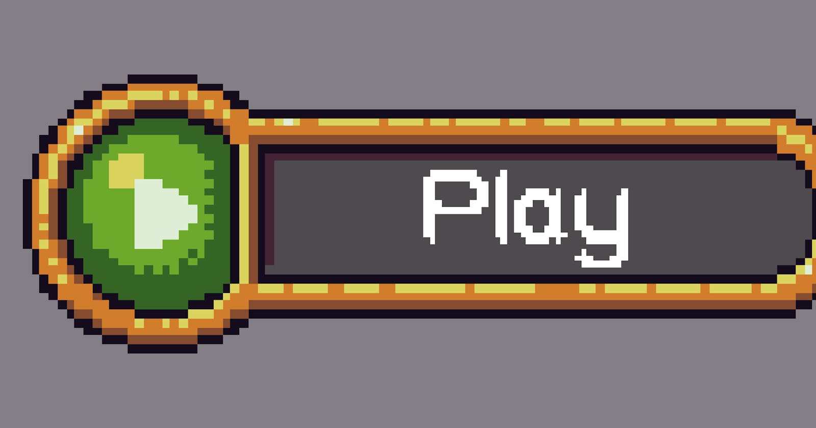
Finally, some buttons were needed to interact with the game. In staying consistent with other GUI elements, I looked to Buch’s Golden UI atlas for these designs. Luckily, buttons such as play and exit were already part of the atlas, so the only work on my end was adding outlines for the mouse hover states. Staying true to most games, the buttons are centered and lined up like so:
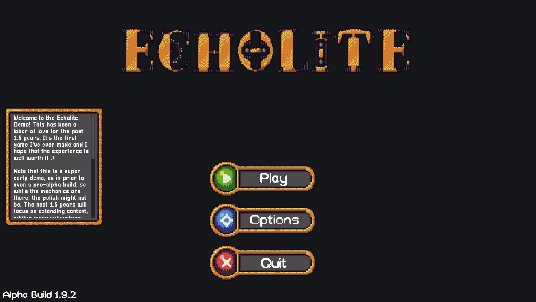
You may notice that I also added a small “message board” of sorts that displays a bunch of text to the left. This uses the same backdrop asset as our “quest options” panel (showing available quests for a NPC). The idea is that once the game reaches a complete build state, I will be able to note key items upfront to keep players updated, such as patch info and future plans.
The actual button functionality was not too difficult after working with them extensively in previous updates. The play button will navigate to the below section, while the exit button requires a built-in application close function in Godot. For settings, this will be handled much further down the line. Once keybinds, audio, etc… are in place, the settings page will naturally fall into place (both during game sessions and through the main menu).
Save Slots
Given the nature of the game with procedural generation, different progressions styles, building, and more, restricting gameplay to a single save is not ideal. This is where save slots come to the rescue! For the save slots, I wanted to have these features:
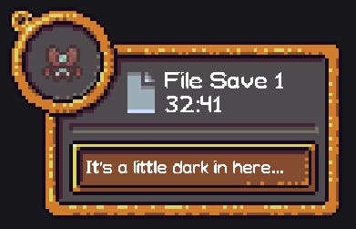
- Chosen character (animated)
- Time played
- Active quest
These elements should help differentiate save slots. I debated showing the active quest as the player could have multiple, but it still seemed worthwhile for providing a “snapshot” of current progression. In terms of art, a mix of existing character models, icon palettes, and GUI elements were combined to form this kind of panel:
Keeping the design simple, these save slots are laid out in a new scene with an identical background to the main menu. The logo is also added again near the top (in case you happen to forget the game’s name after reaching this page!).
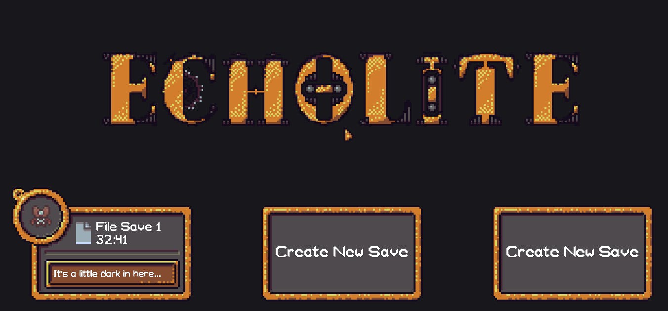
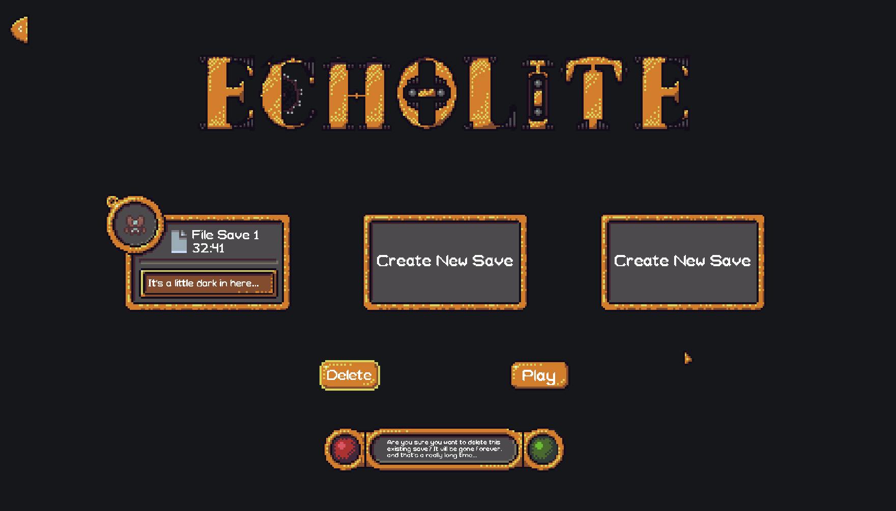
Finally, a few options can be navigated through for selecting existing saves, deleting saves, and creating new saves. All of this simply uses common OS functions through Godot to create and edit directories. Each save is given its own folder for easy management, both as a developer to keep things organized and for players who like to backup their saves to be safe (highly recommend!).
What’s Next?
With the main menu and save slots in place, the core interface is starting to come together! Next up is adding a splash screen that plays before the main menu and implementing customization options for new save files. New characters? - Check. Custom world seed? - You bet! Difficulty options? - How could you not!?!
As always, thank you so much for your incredible support!